Corporate identity is an essential part of branding, reflecting a brand’s image, consistency and loyalty. Branding in the corporate identity marketplace can be seen in signage, wayfinding and interior displays. The materials in which are specified for these applications vary due to several factors including durability, application duration, aesthetics and price point. Architects, designers, and brand managers often specify specific product lines for their consistency in the product’s properties and therefore the ability to create a fluent brand image, even if the same company does not manufacture the signage or displays.
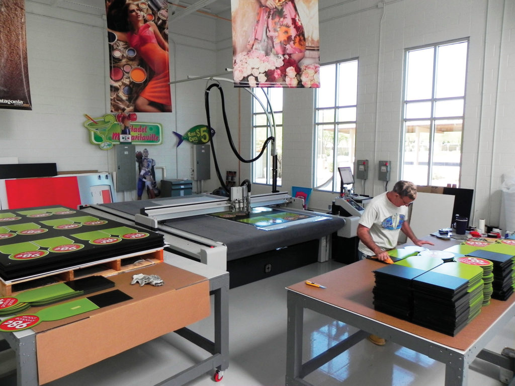
 In an interview with 3A Composites Graphic Display USA, Mike Goldner of Artisan Colour gives us an exclusive insight into the corporate identity (CID) process from his perspective as an account manager with the digital commercial printing company in Arizona.
Goldner reveals that while a client may have an idea of the types of materials they want to utilize, such as an aluminum, PVC, or foam board, the specific product specifications are not “set in stone.” Artisan Colour, as a digital commercial printer, often suggests materials for CID projects based on recommended look and budget. Goldner explains, “Occasionally we quote ‘pre-speced’ as supplied by the architect or designer in which we use the exact materials specified. But, we also offer alternatives to achieve the desired look without the price restrictions. For example, a 1/2″ thick Sintra Board letter is more economically feasible than acrylic, solid aluminum or steel.”
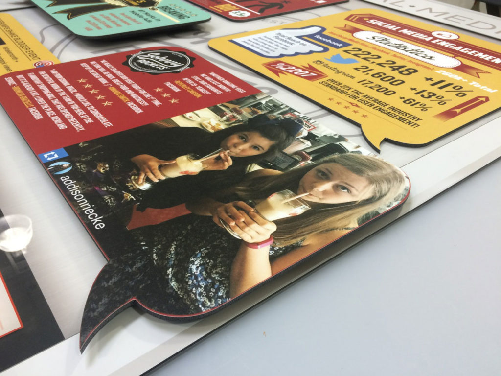 For Artisan Colour, they specify numerous 3A Composites materials for CID programs on both the interior and exterior. Goldner states, “For the exterior, we would certainly recommend Dibond. Depending on the geographic location, Sintra can work as well, but here in Arizona we have to worry about UV and direct sun exposure, but a good coat of automotive grade paint, like Matthews takes care of those concerns. Sintra, with its smooth surface and solid core is great for paint applications.”
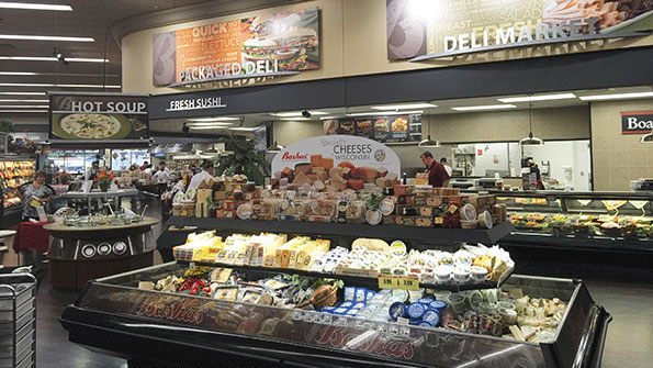
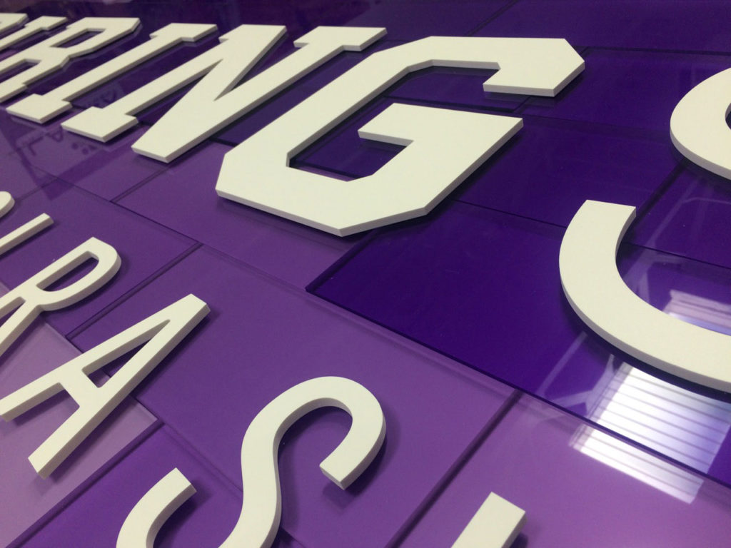
For the interior, Goldner utilizes several 3A materials, particularly Gatorboard [also known as Gatorfoam] which Artisan Colour specifically uses to add unique depth by layering the material. “Recently, we have been using black core, white face Sintra board for a large grocery store roll out…the client likes the clean black edge and we don’t have to worry about flooding the black material with white ink to print to it….the thin white layer gives that same nice bright starting point to lay down color,” further explains Goldner.
 The specification of branding substrates is about consistency, the brands associated with 3A Composites are known for their quality, durability and lightness of weight, which is particularly important with point-of-purchase displays that are often moved to different locations.
When it comes to recommending materials for the CID marketplace, Goldner states that longevity, durability and cost are the “sweet spot, where form meets function.” This of course is critically important to Artisan Colour and the end client [their customer]. If a client is looking for longevity, “…like graphics of a grocery outlet that need to look good and perform for years,” Goldner states, “then Sintra is the best choice.” However, as Goldner further describes, “If the installation is exterior or the artist really wants to add effect, then brushed or white Dibond aluminum composite would be the best solution.”
Whether the application is interior or exterior, long or short term, the materials in which are specified in this exclusive marketplace have to be consistent. Quality is a focal point for the brand manager, sign manufacturers, printers and fabricators in order to ensure that each project meets or exceeds client expectations. CID is a marketplace where branding becomes a promise, a promise that the products you buy are worthy of the brand name.
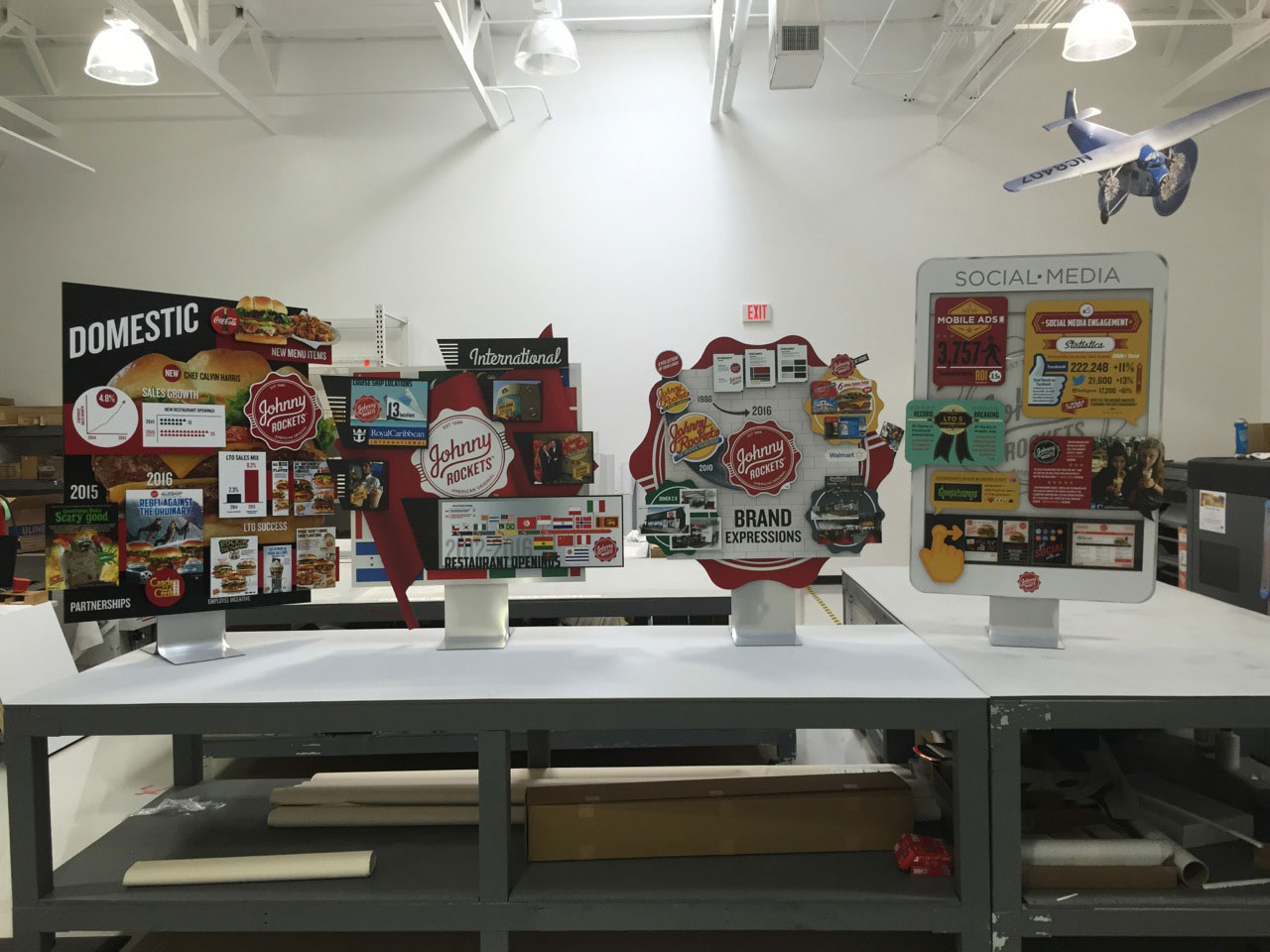
“Matching the image to the perfect media, for style and end-use is what make us ‘print partners,’ not just vendors– for us, 3A Composites is more than a commodity…they are part of a palette, or toolbox we, as graphic consultants, use to give our customers the perfect end-result”
information and photography courtesy of Artisan Colour

